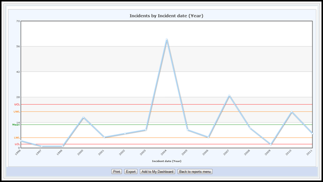
About C-Charts
A c-chart is a time-ordered sequence of discrete data points (countable values) where one aspect of the observation is constant or near constant. For example, a c-chart could visualise the weekly mortality rates overtime for a surgeon who always works five days a week. The number of patient deaths is countable and the number of hours worked is nearly constant.
The upper control limit (UCL) and the lower control limit (LCL) define the boundaries of routine variation - anything above or below these limits is unnatural variation and out of control. These lines are drawn at three standard deviations from the mean value.
The upper warning limit (UWL) and lower warning limit (LWL) point out trends in the data that show an otherwise stable process heading out of control. These lines are drawn at 2 standard deviations from the mean value.
A c-chart consists of:
- Discrete data points that are plotted in time order.
- A centre line drawn at the data set's mean value.
- A set of UCL and LCL lines.
- A set of UWL and LWL lines.